Adding Color
| Previous | Emulsion Home | Next |
|
July 9, 2007 It was inevitable that I wouldn't be able to leave well enough alone. 'I ♥' is what I want it to be - from the clean highlights to the deep blacks - but I've been thinking about color from the beginning. I have fallen in love all over again with black and white, and will almost certainly make b&w emulsion research and photography the biggest part of my foreseeable future, but I thought I'd take a summertime creative detour into the possibilities of combining handcrafted silver gelatin with gum printing. I haven't used color film in years and that was mostly 4x5 transparencies, which I can't scan. So...sounds like a great excuse to finally go digital (more than the little camera I use for web illustrations). A couple of months ago, I got a Pentax K10. It was love at first shoot, even with the steep learning curve. All of my 'I ♥' prints so far have come from scanned 120 black and white film. All of my gum and silver prints will start in the K10. There are so many strategies for making digital negatives that I can't imagine I need to add my two-cents worth. My system is my own. But, since my negatives seem to be working out, I'll guess there's a lot of overlap with most of the other systems. Basically, the printing steps end with Photoshop CS2 RGB color separations. From there, I've been tweaking as I go (another package of Pictorico bites the dust). I think (hope/pray!) I'm close to an S.O.P. (Standard Operating Procedure). If someday I think my system is the best (i.e. "only") I'll be sure to let everyone know.
|
|
|
|
|
|
|
|
|
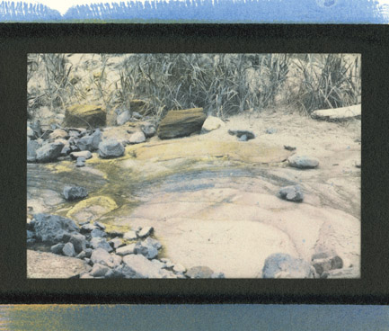
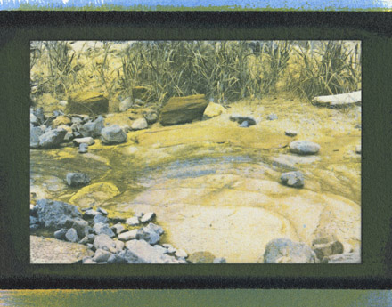
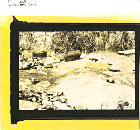
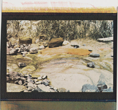
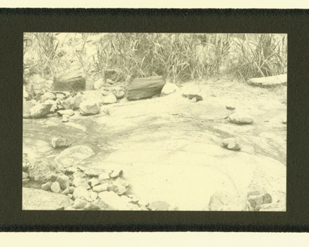
It seemed to me that an AgGel print would be the perfect "K" layer of a three-color gum dichromate print. I took a guess at what might work best and made ten of the same print - very high contrast, just short of a lith look. I knew as soon as I put the first coat of yellow on that my guess was wrong. I think a very high-key, low contrast base will work better, but since I had ten of these puppies, I figured they'd make good testers. 'I ♥' emulsion /Defender 55 Dwr developer/ selenium toned.
|
|
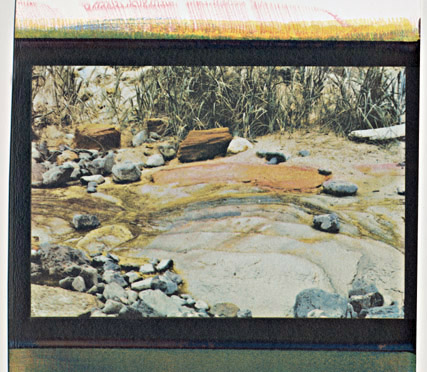
Daniel Smith Water Soluble Relief Ink -Hansa Yellow Medium. 0.5g/ 10ml D.S. Premium Gum Arabic/ 10ml 15% potassium dichromate. |
|
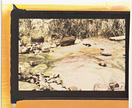
0.3g D.S. ink Permanent Red and 0.3g D.S. watercolor pigment Rhodonite Genuine in 10 and 10. |
|
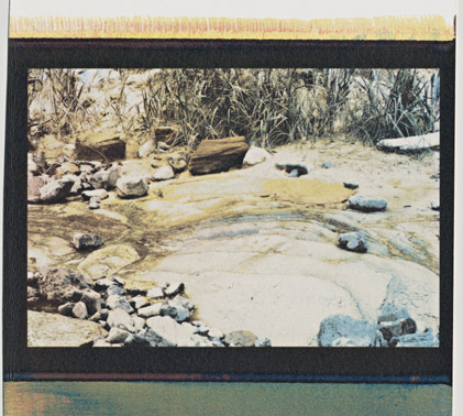
0.4g D.S. Phthalo Blue ink in 10 and 10. I don't like this blue and will be trying blues until I'm happy. |
|
Second yellow coat. |
|
Second red coat. |
|
Second round of blue. Really need a new blue. The print ended up with a greenish cast without even the benefit of the grasses looking properly green.
|
|
|
 |
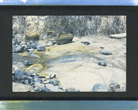
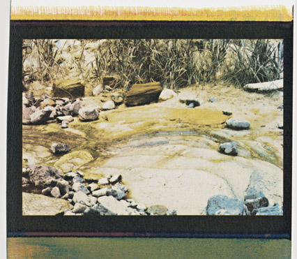
Set #2: Same bases as Set #1. For the next set, I flattened and thinned the negatives and printed only one layer of each color. I would like to get a print right with just three passes. Each time through adds to the risk of registration errors. For this to work, I'll have to get a lot more sophisticated in the ways of gum. |
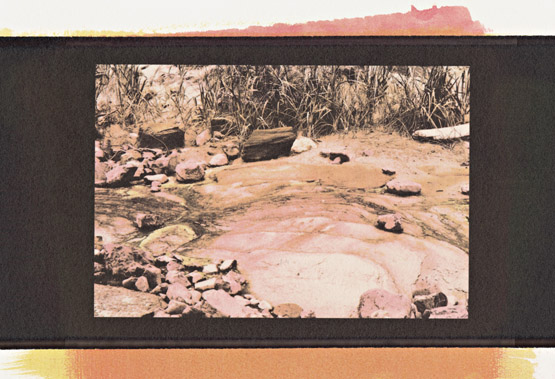 |
Y + R |
 |
Y + R + B |
|
|
 |
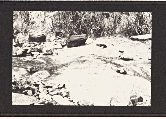
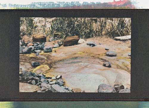
OK. Honesty compels that I show the original digital image. Always nice to have a goal!
|
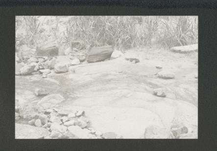
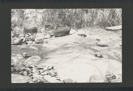
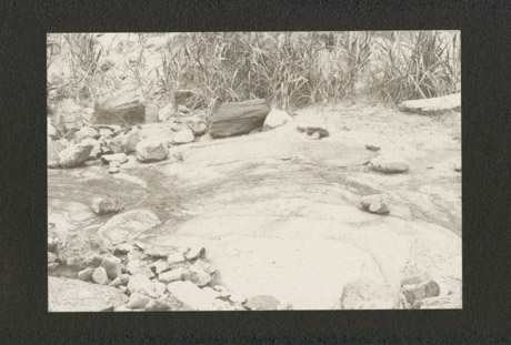
I made a variety of silver gelatin "K-layers". I think I'm aiming for
light, bright, and clean, but we'll have to see. I might have to learn
to love dark, broody and moody - although I'd have a hard time learning to
love cartoon colors. I settled on playing through on two
variations: a light, low contrast print and a high-key 'natural'
interpretation. I also tried a number of sheets with a watercolor wash
under the the silver gelatin layer. All prints made on Fabriano HP Extra
White watercolor paper.
 |
 |
 |
 |
|
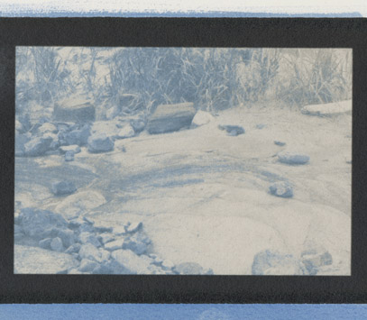
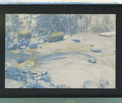
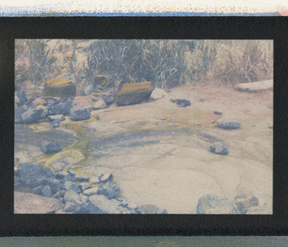
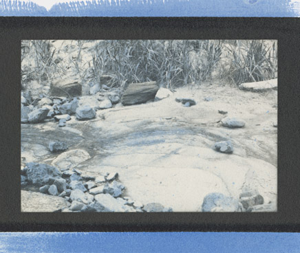
| Negative #1: Light, low contrast. | Negative #2: Bright natural. | Negative #2: Printed on paper with a watercolor wash (Naples Yellow) Too subtle. | Negative #2: Printed on paper with a Lemon Yellow wash. Not near subtle enough. |
Set #1: I decided that the very soft look was a dead end and didn't try to punch up the color with extra layers.
|
Set #2: I think this negative interpretation is just about right.
Next time, I going to try for a little higher key, but I think it's important
that the underlying b&w print have a full density range.
|
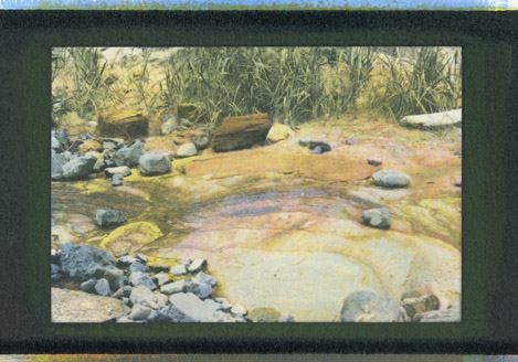 |
Conclusion from this round: I think the pigment components are close enough for now, although I think the yellow is too heavy. Next time, I'll try just Lemon Yellow as the yellow layer. The next important step is understanding the separation negatives well enough to control them and the color balance they dictate. (I have a goal of the negatives being smart enough to do the job of burning and dodging for me.)
| Previous | Emulsion Home | Next |